

ADVERTISEMENT
More Stuff
Charts are used to display series of numeric data in a graphical format to make it easier to understand large quantities of data and the relationship between different series of data.
To create a chart in Excel, you start by entering the numeric data for the chart on a worksheet. Then you can plot that data into a chart by selecting the chart type that you want to use on the Office Fluent Ribbon (Insert tab,Charts group).

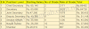
This is a sample data we will create chart using this data


To create a chart in Excel, you start by entering the numeric data for the chart on a worksheet. Then you can plot that data into a chart by selecting the chart type that you want to use on the Office Fluent Ribbon (Insert tab,Charts group).

- Select cells A3 to D6. You must select all the cells containing the data you want in your chart. You should also include the data labels.
- Choose the Insert tab.
- Click the Column button in the Charts group. A list of column chart sub-types types appears.
- Click the Clustered Column chart sub-type. Excel creates a Clustered Column chart and the Chart Tools context tabs appear.


0 Comments